The Logo Of Qingdao Huagang Transportation International Logistics Co., LTD. Was A Continuation Of The Classic Of History, But Also A Starting Point Of The Enlightenment Future Success.Picture Of Red Sailing Draw The Outline Of A Different, Reliable And Professional Corporate Image, And Shipping Characteristics Are Distinct.The Logo Want To Convey To The Brand Idea Of China Ports International, A Red Sailing, The Significance Of China Ports International Hope To Establish A Good Relationship With Customers At Home And Abroad.Around Two Sails Firmly Connected Together, As A Symbol Of Our Partner Relationship With Customers Is Solid And Reliable, Manifests The China Ports International Is Consists Of A Group Of Persistence, Trustworthy, Sincere Good Team Who Are Concerned With The Development Of Shipping Industry, So As To Provide Customers With Safe, Efficient, Convenient And The First-Class International Logistics Transportation Services.
◆Company Tenet: People-Oriented, Creating The Best Team And Provide The Most Perfect Service.
◆Company Planning: Efforts To Develop Into A Collection Of Shipping/Storage/Rail/Shipping Agent/Freight Forwarder/Bulk Cargo Charter In A Body's Comprehensive International Logistics Companies.
◆Corporate Philosophy: Customer First, Win-Win Cooperation!
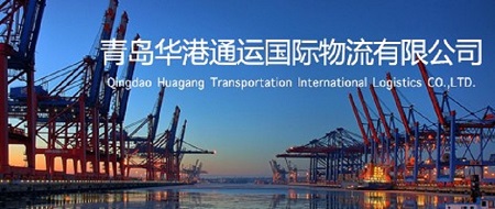
In 2008,established "QINGDAO HUAGANG TRANSPORTATION INTERNATIONAL LOGISTICS CO.,LTD. "in Qingdao Jinhuan Square
and set up "Huangdao Office";
In 2009,moved to Huaren International Building;
In 2010,set up "Huangdao Logistics Department";
In 2011,set up "Huangdao Warehouse Department";
In 2013,moved to Xiwang Tower;
In 2014,set up "Customs and CIQ Clearance Department" for a complete set of import and export services;
In 2016,set up "Traffic Department";
In 2018,established network technology Co. and developed the logistics distribution platform.